Riksrevisjonen
Creating history by designing the first digitally published report for the Auditor General of Norway. This project was awarded a special mention at the Aiap Women in Design Awards.
The Auditor General of Norway’s (Riksrevisjonen) primary task is to monitor the public sector on behalf of the Norwegian parliament. This monitoring results in a number of reports every year where they assess how the public sector is doing their job.
Branding
The Riksrevisjonen brand was characterised by the fact that it was primarily created for printed materials, and was starting to look out of date. When working on digitising Riksrevisjonen, it was only natural to start by looking at how the branding could be tweaked to work in a digital context. While preserving the ideas and concept of the old logo, I made the necessary adjustments to transform it for modern times and digital surfaces.

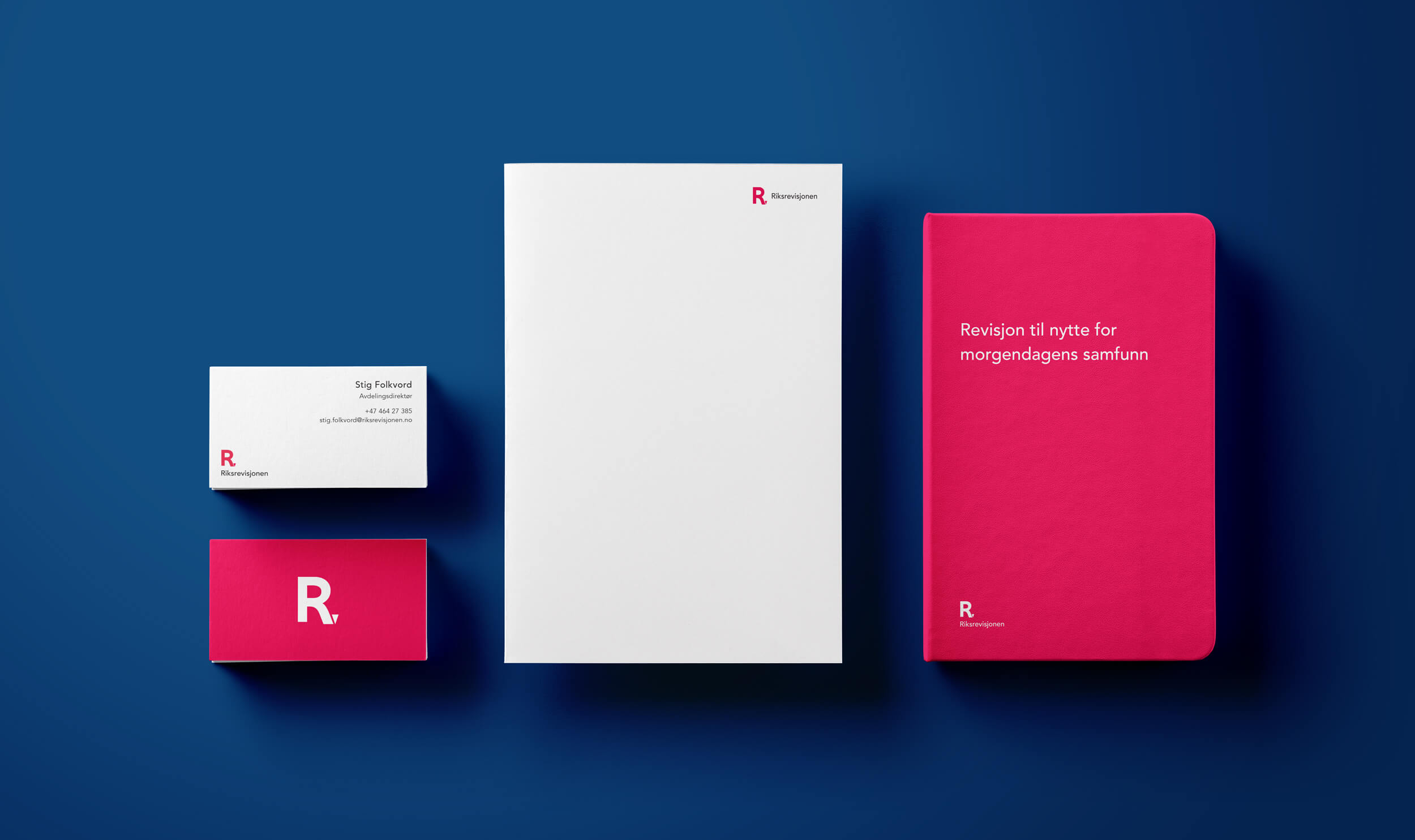
In addition to the updated logo, I also defined new colours, typography, image style, and other elements to use when communicating the brand – this was all done with a “digital first” approach where accessibility and legibility on screen were essential. All of this was documented in an online style guide. While the branding was first and foremost created to work digitally, I also made sure it would be transferrable to printed materials too.
New website
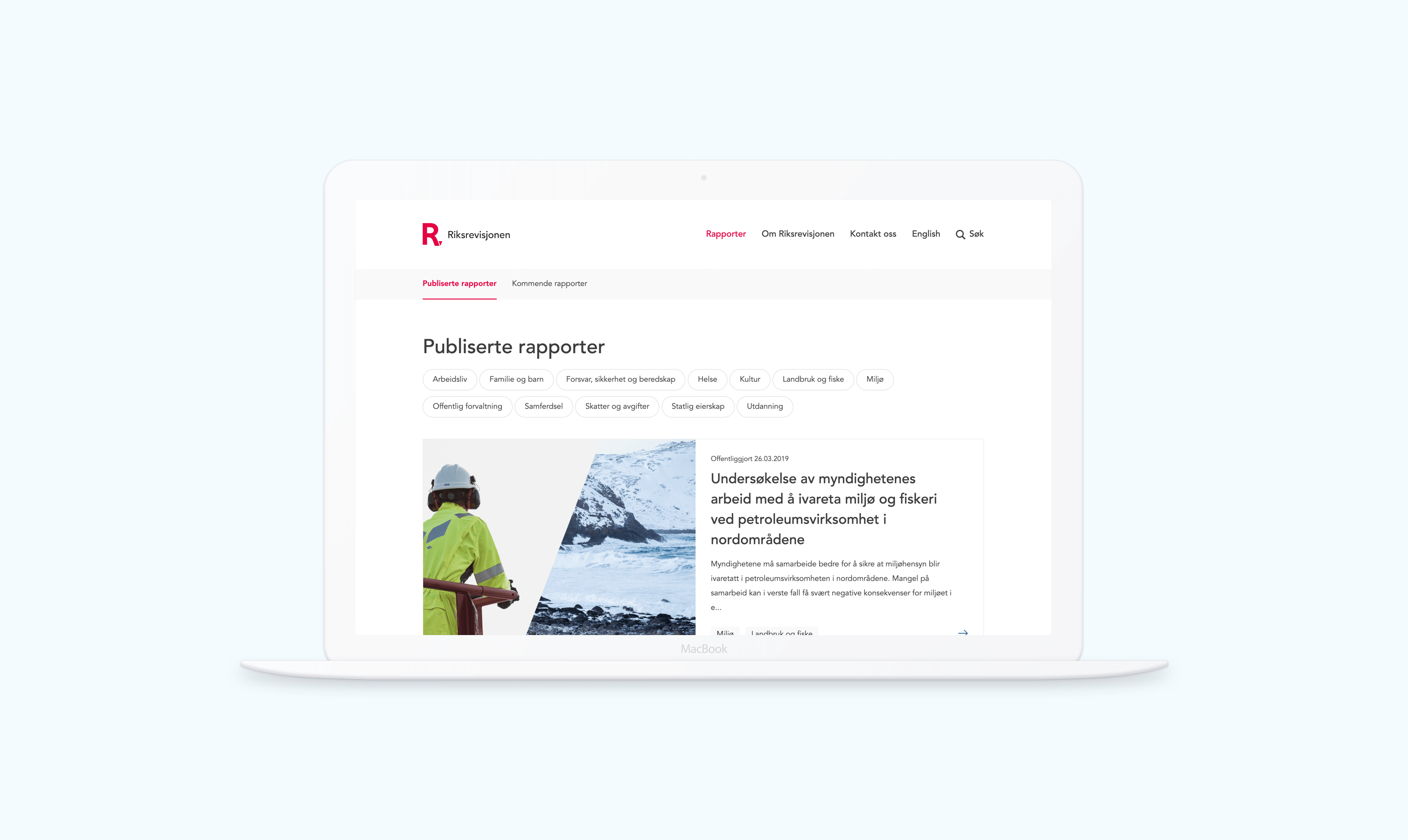
The new website is focused around the top user tasks, rooted in several rounds of user interviews. Including the users throughout the whole design process, we found out that most people would visit the site to read about reports, and that the report summary page often gave them the answers to what they were looking for.
Digital reports
The reports had all up until now been a printed publication, which was uploaded as a PDF to download from the websites. Long PDF documents are hard to navigate and read on a screen, and are not very mobile friendly on the go. We were assigned with the task of creating a framework for Riksrevisjonen’s first digitally published report.
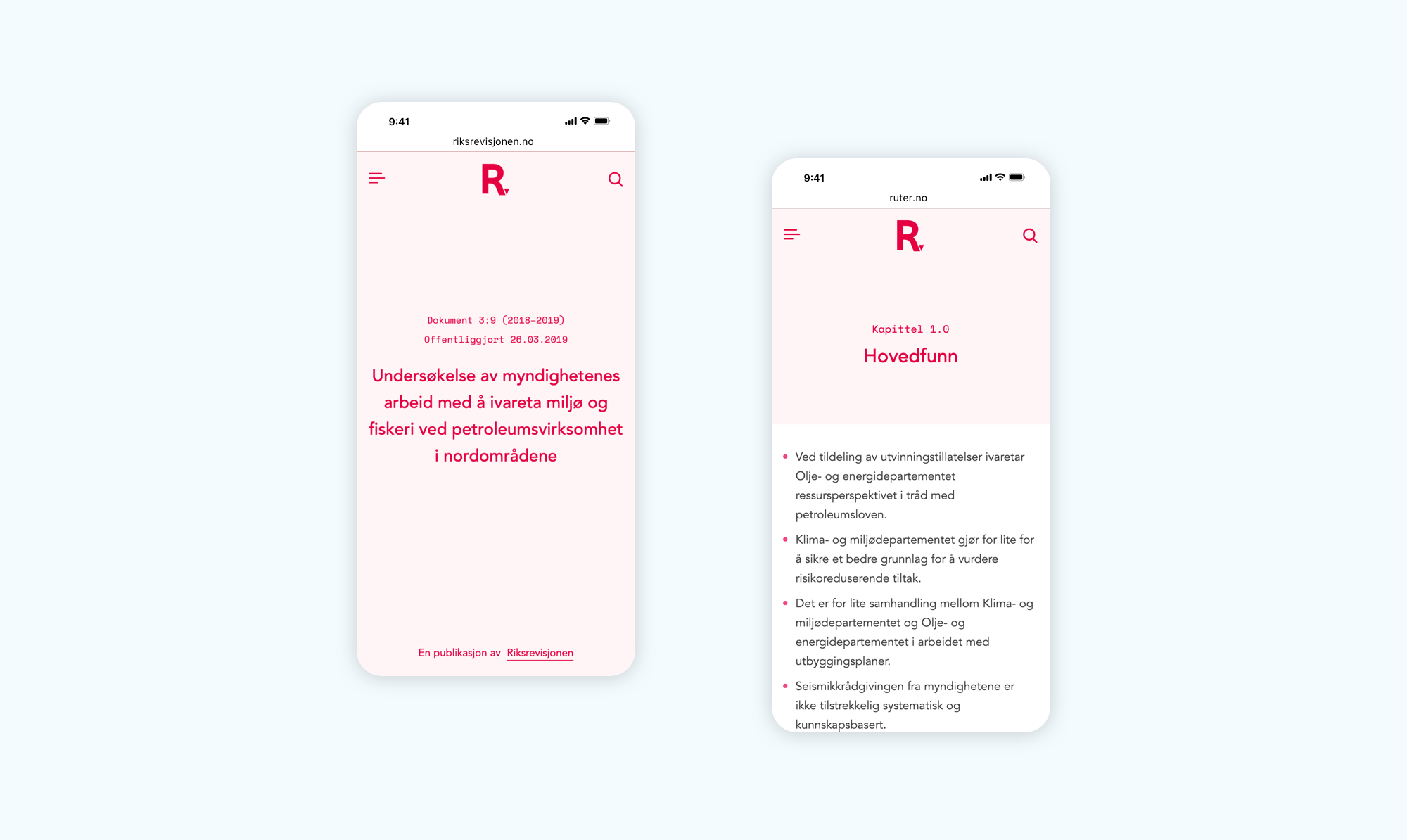
When testing prototypes on users, it became clear that navigation was key in a digital publication like his. We made sure to always have several ways of navigating to the same piece of content, tailored to different contexts and mindsets. With a table of contents on the front page, a full screen navigation, search, subnavigation within chapters and previous/next buttons, all grounds were covered.
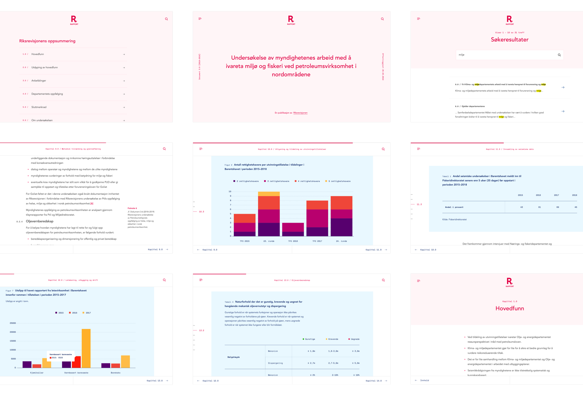
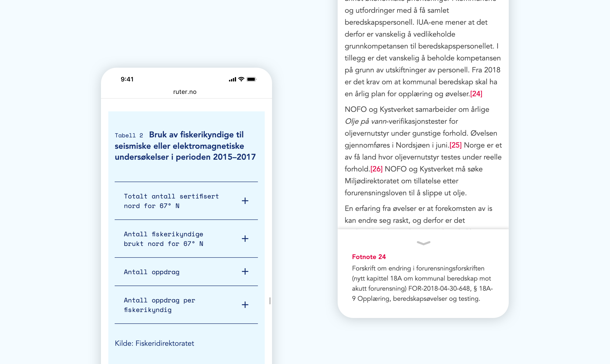
Riksrevisjonens reports have a great use visualisations to better explain different types of data. We created a style and system for graphs with colours that we tested for accessibility and common types of colour blindness. Tables were custom-made, and rows are collapsed into accordions on mobile for better legibility when comparing data.
Transferring a traditionally printed document to a digital format opened up for innovation on elements that are normally not created for the web. One such thing was the footnotes, which are positioned in the text as most people would expect, but the info opens up in context of the reader, and you won’t have to scroll all the way down the page.
