Tekna
Crafting a personalised and user centric experience for members of Norway’s largest association for natural scientists and technologists.
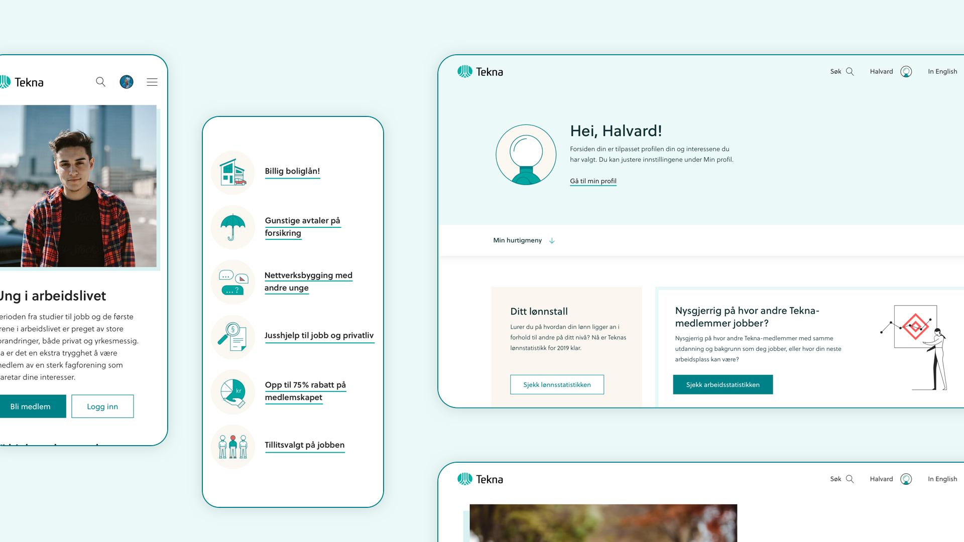
Tekna is Norway’s leading workers union for professionals with a masters degree in natural sciences and technology. Catering for 82 000 members, Tekna offers a range of membership services like salary statistics, legal counsel, career guidance and events. They wanted to better communicate their benefits and relevance to their membership base. This was done through a personalised dashboard experienced for the signed-in members, a fresh new visual design, and landing pages targeted at the specific user groups.

Digital visual design
Tekna’s existing brand guidelines were primarily created for print collateral, making it difficult to apply the identity concept to a digital setting right out of the box. Based on this, I took the core brand elements and made adjustments with digital in mind, while bringing it into a more contemporary style. Lighter shades of the brand colours were added for for playfulness, typography was adjusted to lighter weights, and the primary brand colour were adjusted to meet accessibility requirements. This resulted in an expanded toolbox for the brand, built for digital.
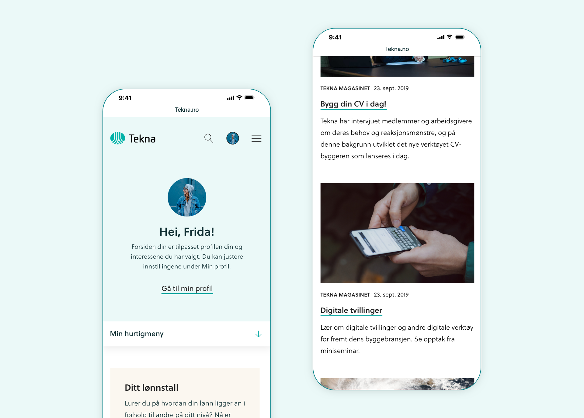
Personalised dashboard
One of the focus areas of this project was to create a personalised experience for signed in members. Based on your industry, interests and career status, you will get a selection of articles, courses and content just for you.

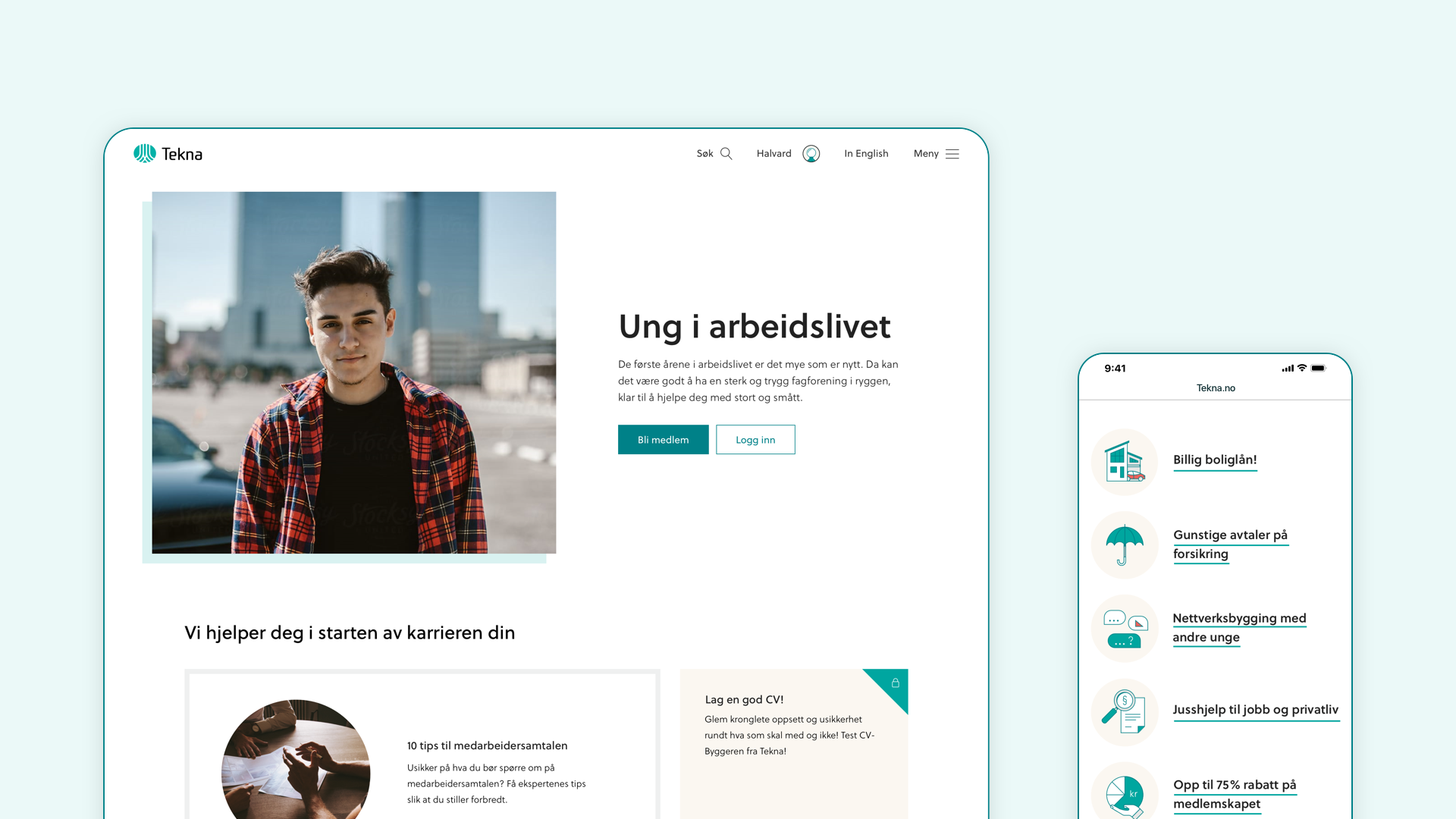
In addition to the personalised dashboard, landing pages directed towards each of the audience groups were designed. The goal of these landing pages were to push conversions for new members, but also make existing members more aware of their membership benefits.

Tekna Magazine
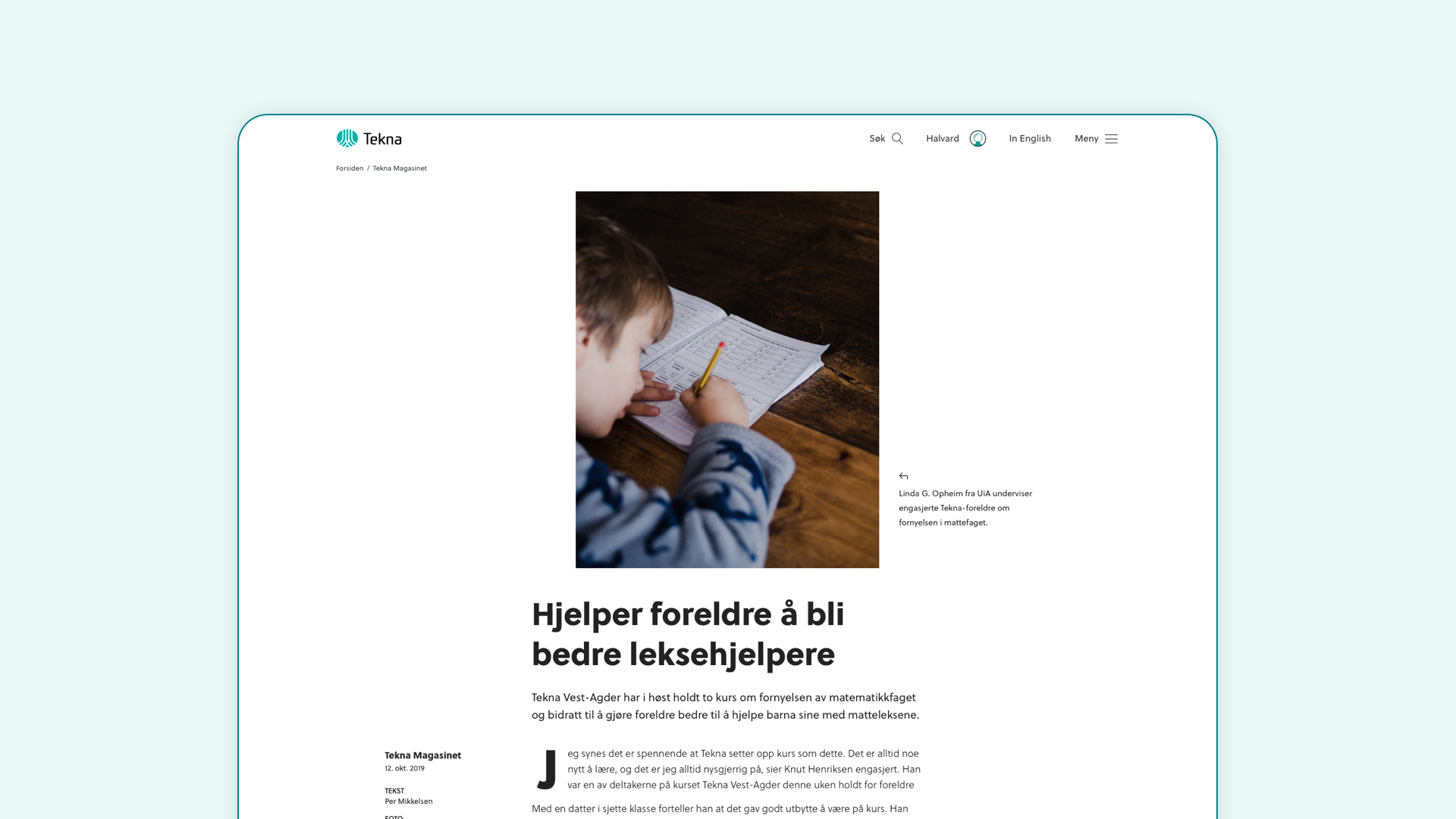
Tekna produces a magazine with content for and about their members. This is typically long-read feature articles, rather than traditional news. The magazine was previously on a separate domain with no particular branding. As a part of this website process, we moved the magazine over to the main site, while giving it a new look and feel.
The design takes inspiration from elements in print publication, creating a magazline-like feeling. It needed to adhere to the Tekna brand, but at the same time be differentiated from the rest of the website. This was done by using a bolder font-weight throughout, combined with a playful, dynamic layout for the articles.
